Extra Sensory Perception Statistics:

rhine_zener

In today’s post, I am going to combine two of my favorite topics – mindreading and statistics.

I should confess upfront that I do not read minds, at least not literally. I do have a passion for magic and mentalism. I would like to introduce the readers to Joseph Banks Rhine. He is the creator of ESP (Extra Sensory Perception) cards. These are a set of 5 cards with 5 shapes (circle, cross, waves, square and a star). These cards were used for testing ESP. The readers might remember the Bill Murray scene in the movie Ghostbusters. The ESP cards are a common tool for a mentalist.

In 1937, Zenith Radio Corporation carried out multiple experiments under the guidance of Rhine. A selected group of psychics chose a “random” sequence and transmitted it out during the radio show. The listeners were asked to “receive” the transmitted sequence, write it down and send it back to the radio station. The sequence had 5 values and each value was binary in nature. This could be heads and tails, light and dark, black and white, or a group of symbols. The two values were represented as 0 and 1. Thus, a possible sequence could be 00101.

The hypothesis was that human beings are sensitive to psychic transmissions. It is reported that over a million data points were collected as part of these experiments. From a statistics viewpoint, this is a statistician’s dream come true!

The results of the study implied strongly about the existence of ESP. The number of correct guesses was significantly high, if the calculations were based on assumption of randomness.

A million data points is a statistically valid sample size. The studies were blind in nature. The “psychics” in the radio station did not cheat. The responding listeners did not have a way to know the sequence before-hand. So did they prove that ESP is real?

Enter Louis Goodfellow:

Goodfellow (an apt name) was a psychologist involved in the study. He realized something was fundamentally wrong with the study. The data that was transmitted was not truly random. The data was “randomly” chosen by the psychics. Unfortunately, being random is not something that we, human beings, are good at. We will try really hard to create a random sequence, and in the process create a completely non-random sequence. Certain sequences are chosen more than the others, across the board. With over a million data points, there should have been close to 3% occurrence of 11111 or 00000. The data showed this was actually less than 1%. Additionally, with such a large sample size, we would expect uniform data, meaning all sequences should show up with nearly equal proportions. This was not the case either.

In other words, the study revealed that the psychics were indeed human beings. Goodfellow repeated the study without involving the psychics. The study group was required to create a “random” sequence. The resulting data was very much similar to the Zenith radio data. Goodfellow also repeated studies with truly random sequences, and the study group failed to “receive” the sequences. (A psychological interpretation of the results of the Zenith radio experiments in telepathy)

The basic assumptions of independence and randomness were not followed for the original study. Thus, we still do not have evidence that ESP is real.

Always keep on learning…

Machine – Let your imagination run wild!

main

On June 17, 2015, Mordvintsev, Tyka et al posted a blog on the Google Research Blog. The title of the blog was interestingly “Inceptionism: Going Deeper into Neural Networks”. This post discussed using the Machine Learning algorithm, Neural Networks to identify objects in any picture. This was referred to as “Deep Dreaming”. Since then, the concept of machines dreaming has gone wild!

Neural Network is a Machine Learning algorithm used for fields like speech recognition, character recognition etc. The algorithm requires supervised learning at first. At this stage, the algorithm is trained using known samples. The strength of the internal networks gets stronger as the algorithm gets more answers correct. This weakens the pathways leading to incorrect answers, and strengthens the pathways leading to correct answers. Once the “training session” is over, the algorithm will be used on new samples, where the answer is not provided to the algorithm.

Google has created a program aptly named “DeepDream”. In their own words;

Google has spent the last few years teaching computers how to see, understand, and appreciate our world. It’s an important goal that the search giant hopes will allow programs to classify images just by “looking” at them.

And this is where Google’s deep dream ideas originate. With simple words you give to an AI program a couple of images and let it know what those images contain ( what objects – dogs, cats, mountains, bicycles, … ) and give it a random image and ask it what objects it can find in this image. Then the program start transforming the image till it can find something similar to what it already knows and thus you see strange artifacts morphing in the dreamed image (like eyes or human faces morphing in image of a pyramid).

In other words, we are encouraging the machine to run their imaginations wild with pareidolia, the phenomenon where one sees a shape or a form on an unrelated object, like seeing a face on the surface of the moon. The algorithm will try to find objects in a picture, and any resemblance is made stronger and stronger until it creates a familiar object. Of course, I wanted to test this out. You can see the deep dreaming effects on my current LinkedIn profile picture.

FullSizeRender

IMG_2492

You can see that my black hair was used to weave in imaginary eyes. Interestingly, my beard became the face of a dog. The algorithm uses the pictures database it knows (over 1 million pictures). Thus most of the dreamed pictures are common animals and objects.

I thought I would then test the algorithm with Card III from Rorschach Inkblot test. This card is seen to have two humans or ape like shapes interacting with each other.

IMG_2494

IMG_2496

The algorithm was able to identify two dogs with weird limbs, another dog in the middle, and two containers of some sort.

Practical Uses:

This program is very entertaining and provides insights into how the machine actually sees or dreams, as Google likes to put it. Other than the entertaining and deep philosophical aspects of a machine dreaming, there are practical uses for this.

What if the machine can imagine a picture through the eyes of a famous artist? Using a similar algorithm, we can have a “new” painting from Vincent van Gogh of the Eiffel Tower. I have taken the following example from here. You can see that the clouds were enhanced with the strong Van Gogh style strokes.

eiffel-tower-1 starry_small eiffel-tower-1_as_starry_small

More examples were found here. The following is the Starry Night version of San Francisco Golden Bridge.

golden_gate golden_gate_starry_scale1

We can apparently go one step further, and imagine what a painting of Golden Bridge would look like if it was part Vincent Van Gogh’s Starry Night and part Edvard Munch’s The Scream.

The_Scream golden_gate_starry_scream_5_5

I am blown away by this!

Can we go from Stills to Animation?

Apparently, this does not stop here. Mbartoli has created an algorithm that converted a gif file of a scene from 2001: A Space Odyssey in the artistic style of Edvard Munch’s The Scream.

original processed

My Favorite Example of Machine Learning in a Movie or a TV Show:

I have been enjoying learning Machine Learning. I always keep my eyes open for movies or TV shows that feature some form of Machine Learning. Recently, I came across “Be Right Back“, the first episode in season 2 of the British TV show, Black Mirror. If you have not seen the show, I highly recommend it. I will be revealing the main plot of the episode here, so if you have not seen it, you may want to stop reading now.

The premise of the episode is that the main character, Martha, loses her boyfriend, Ash, after he dies tragically in a car accident. Ash was a heavy social media addict. The brilliant notion that the episode put forth is this – can a computer be trained with all the social media left behind by the boyfriend in the form of tweets, blog posts, videos etc. and create an AI (Artificial Intelligence) boyfriend? The AI boyfriend looks and sounds like Ash. It also makes jokes as Ash would. Maybe, this is the final frontier? Man living on through Artificial Intelligence!

What the future holds – DeepDreamFlix?

In the future, you can turn the DeepDreamFlix app on, and type in “Alfred Hitchcock + Jackie Chan + Western” and the app will create a brand new Western movie directed in the style of Hitchcock starring Jackie Chan. 🙂

This post was written to introduce the cool concept of Neural Network, and to encourage the reader to get interested in Machine Learning. There are many free and cost effective courses online. I highly recommend Udacity, and Coursera.

Edit on 9-12-2017 – Another good resource that was brought to my attention is Springboard.

Always keep on learning…

Process Capability – Are You Really Capable?

sigma

I have always been interested in process capabilities. I will not be going into how you can calculate the process capability in this post. In this post, I will try to look into the feasibility of a process capability study. The goal of this post is to encourage the reader to understand the process capability and sigma value correlation. The most popular value for a process capability index seems to be 1.33. This is applicable for Cpk or Ppk.

There are two ways you can look at your process capability. The first way is Cpk, commonly referred to as Short Term Capability. This assumes that your process is stable, and uses the R/d2 estimate for standard deviation.

The second way is Ppk, commonly referred to as Long Term capability. This is for used looking at the potential capability and uses the sample estimate of standard deviation in the formula. There is no need of assumption of stability for using this.

Relation between Sigma value and process capability index:

The formula for calculating the sigma value from the process capability index value is show below.

Sigma = 3 * (Process capability index value)

Thus if your Ppk value is 1.33, this equates to a sigma value of 4.

A ppk value of 2.00 refers to the ever famous 6 sigma value.

Why 6 sigma values are hard to conceive:

I came across a cool table that correlates the sigma values to approximated frequency of daily events (if the event was to occur on a daily basis). Please note that this does not include the 1.5 sigma shift and assumes normality.

Process cap

Please note that the column in the right is based on the assumption that the event is occurring on a daily basis only.

So next time you achieve a process capability value of 3.00 or more, understand that this indicates a sigma value of 9.00 or more. In other words, it is quite impossible to achieve such a feat. This could be a strong indication of autocorrelation. Autocorrelation indicates that the data you collected are extremely homogeneous and that this may not include any possible process variations. Of course, the other possibility is that the specifications are very wide. More on this on a later post.

Always keep on learning…

Is Murphy’s Law alive and well?

James_Edward_Murphy

In today’s post, I will be trying to look into Murphy’s Law.

There are multiple versions existing for this law, the most common version being – “whatever can go wrong will go wrong”. Some other variations are as follows;

  • If there is a possibility of several things going wrong, the one that will cause the most damage will be the one to go wrong.
  • If everything seems to be going well, you have obviously overlooked something.
  • Nature always sides with the hidden flaw.

Murphy’s Law makes a pessimist out of the most optimistic man. Is it true that the universe has a tendency for causing things to fail? Does Murphy make a rational man go “Why me?”, when something unexpected happens?

A common version of Murphy’s law is the case of buttered toast. The buttered toast always fall on the buttered side. Let’s look into this deeper.

Does buttered toast listen to Murphy?

The following section is taken from “The Australian Journal: A Weekly Record of Literature, Science, and Art, Volume 23”, from 1888. The highlighted section shows that the idea of buttered toast/bread falling on its buttered side is common, even in the 1800’s.

AustralianJournal

Interestingly, studies have shown that buttered toasts fall on their buttered side almost 62% of the time. This would mean that it is not a fifty-fifty chance like flipping a coin. Why? This seemingly curious “bad luck” can be explained with science. Delving deep into the case of buttered toast, it becomes clear that the following factors always remain the same;

  • The toast always starts with the buttered side face-up
  • The height of the fall is similar (2-3 feet). This is because the toast is held at waist height generally, and in the case of falling from a table, the standard table height is between 2-3 feet.

These two factors increase the chances for the toast to fall on the buttered side. In fact, studies have shown that when toasts are thrown up in the air, the likelihood decreases to fifty-fifty. Alternately, when the toast is dropped from a height of 7-8 feet, the likelihood of buttered toast falling on the unbuttered side goes up back to about 62%. The reader can find more about this here and here.

Does Murphy still seem threatening?

Factors which cause Murphy to visit:

I have compiled a list that explains why Murphy is prevailing.

  • Nature of humans: Humans always remember when something bad happens to them. Do you remember the last time your car broke down and you had to call for it to be towed away? Do you remember the other 99.9% of time, where you did not have any problems with the car? Since your brain likes to avoid making mistakes, it likes to recall the bad times more so that you do not repeat the same mistakes. The downside of this is that it can make you start noticing only the bad events. Think of a large white paper with a small black dot. Our attention is on the black dot, and not at the remaining 99.9% of the white space.
  • Law of large numbers: The bad thing about events with relatively small probabilities is that they will still happen. No matter how small the probability, with enough chances the event will happen. The probability of winning the powerball lottery is 1 in 292,201,338. Even with such a small probability, people still win the lottery on a regular basis. The probability of somebody winning a lottery goes up when the prize gets really high (>$300 Million). This is because, a larger amount of tickets are sold during that time. As Law of large numbers dictates, with enough chances even the low probability event of winning a lottery happens.

Combining the Nature of Humans, and the Law of large numbers, you have the perfect storm that allows Murphy to rule the world. The egocentric view of humans tends to make events about them, when from a probability standpoint, it could have happened to anybody. There is a profound difference between asking “What are the chances of it happening” and “What are the chances of it happening to me?”

  • Law of Nature: It is the law of nature that everything degrades over time. Eventually, all products will fail. A good example is when you move into a new house, and after about 7 years, more than one appliance starts to breakdown. First it was the refrigerator, and now it is your washer as well. The fact that the two appliances were bought together might escape your mind, and you will blame Murphy.
  • Poor Processes: In relation to item 3 discussed above, if you have poor processes, the chance of multiple things to fail goes up. A good example is poor preventive maintenance procedures. Multiple equipments can break down at the same time, if they are not maintained properly. If one equipment can go bad, there is a good likelihood for another to go bad at the same time, if the same poor preventive maintenance program was being used. A poorly designed system can become a playground for Murphy.
  • Special Causes: Sometimes the unlikely event(s) happens due to special causes. Sometimes this special cause can be an enabling condition that allows multiple things to breakdown. The special cause at times is people. People are inherently inconsistent, and they can add inadvertent variation to the process that makes thing go wrong.
  • Complexity and Chaos: Murphy’s law is very much relevant in the presence of complexity and chaos. In the presence of disorder and uncertainty, the reliability of a system can breakdown easily. Any order from constraints is disrupted and this allows more things to go wrong. I welcome the reader to visit Cognitive Edge website to learn more about this.

Final Words and the story of Arthur Ashe:

As detailed in the buttered toast section, it is imperative that one tries to understand why something went wrong. What are the factors affecting the process? What are the chances of the event to happen? Is there indeed a pattern or is the pattern created by the perception? The buttered toast is a rigged game where there is high likelihood of the toast to fall on its buttered side when dropped from a height of 2-4 feet.

WHY ME?

Arthur Ashe, the legendary Wimbledon player was dying of AIDS which he got due to infected blood he received during a heart surgery in 1983.

From the world over, he received letters from his fan, one of them conveyed: “Why does God have to select you for such a bad disease?”

To this Arthur Ashe replied: The world over–50,000,000 children start playing tennis, 5,000,000 learn to play tennis, 500,000 learn professional tennis, 50,000 come to the circuit, 5000 reach the grand slam, 50 reach Wimbledon, 4 to semi finals, 2 to finals. When I was the one holding the cup, I never asked god “Why me?”

And today in pain, I should not be asking GOD “why me?”

Always keep on learning…

100% Visual Inspection – Being Human

100%

The FAA (Federal Aviation Administration) defines visual inspection as “the process of using the unaided eye, alone or in conjunction with various aids, as the sensing mechanism from which judgments may be made about the condition of a unit to be inspected.”

Visual inspection, especially 100% visual inspection, is used by many industries as part of their Quality or Risk Management programs. Sometimes, as the last resort, companies implement 100% inspection if the residual risk is deemed to be high. I had previously written about inspection here and here.

In this post, I will discuss visual inspection in detail, value of 100%, 200% or 300% inspection (100% inspection followed by 100% inspection by one or two inspectors), factors impacting visual inspection, and end with a story from the field.

Flow chart for visual inspection:

The figure below is taken from the book “Human Reliability in Quality Control”, edited by C G Drury and J G Fox.

flowchart

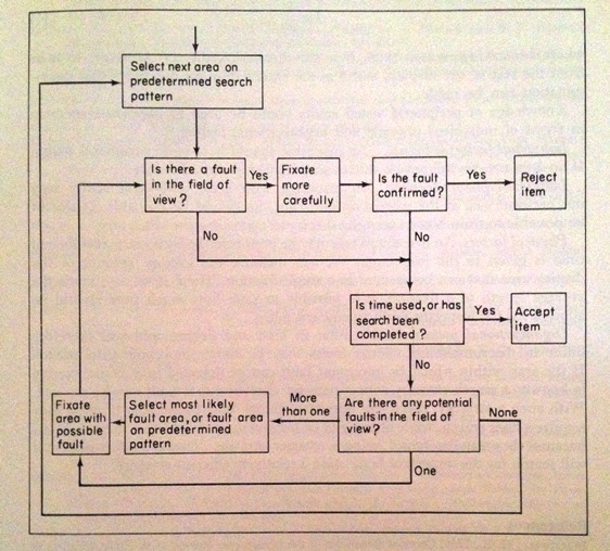
Figure 1: Flow chart for visual inspection

In “Visual Inspection: A Review of the Literature” by Judi E See (a Sandia National Laboratories report), visual inspection is detailed in a five step process:

In general, there are five basic steps that must be completed during an inspection task:

  1. Set up: obtain procedures or work instructions, items to be inspected, and equipment needed for inspection
  2. Present: prepare item for inspection (e.g., by installing in holding fixture or microscope)
  3. Search: examine item for possible defects
  4. Decide: compare potential defect against standards to determine if it exceed the standards
  5. Respond: accept or reject the item based on the decision made in Step 4, mark the item as needed, and complete required paperwork

Effectiveness of 100% Inspection:

Juran, one of the giants of Quality, has written that, based on his studies performed on Inspector accuracy, 100% inspection is about 87% effective. Juran gave the following formula to calculate the Accuracy of an Inspector.

Accuracy of inspector = percent of defects correctly identified = (d-k)/(d-k+b)

where   d = defects reported by the inspector

k = number of good units rejected by the inspector

d-k = true defects found by the inspector

b = defects missed by the inspector, as determined by check inspection

d-k+b = true defects originally in the product

This brings us to the next question, is 200% or 300% inspection effective?

From a pure probability standpoint, multiple inspections are indeed effective. For example, if we determine that 100% inspection is 85% effective (as an example), we can then calculate the probability of rejects being identified by at least one inspector.

P(rejects being identified by at least one inspector) = 1 – (1- e)^n

where   e = inspection effectiveness (85% in the example)

n = number of 100% inspections (3 in the example)

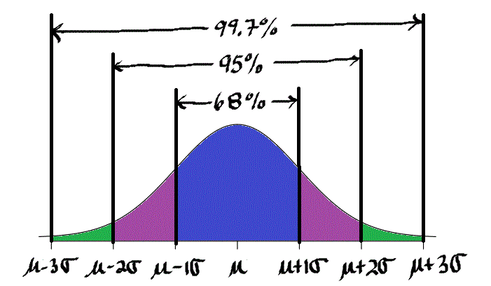
Thus, we can determine that the 300% inspection with an inspection effectiveness value of 85% is 99.7% effective. In other words, 300% inspection will still result in 0.3% of the bad product to be missed.

The number of rejects caught by 100% inspection can be found by the following calculation.

# of rejects caught = N * p * e

where   N = Lot size

p = % non-conforming product

e = inspection effectiveness

Please note that all this math and probability may not hold water in real world. This is because we were treating the three events of inspection as independent events. In real life, Inspector 3 might assume that Inspector 1 and 2 are extremely good, and that he does not need to pay full attention. Unfortunately, this bad logic may be used by Inspector 1 or 2, and in the worst case by all three inspectors. This type of “leaning on the other inspector” thinking breaks the independent event assumption we used in our probability calculation.

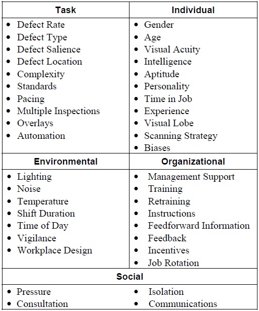
Factors impacting visual inspection:

In the wonderful report from Judi E See, we can also find a detailed list of factors that can impact inspection performance. One can find that any Attribute Agreement Analysis that is performed on visual inspection can be quickly challenged due to the high number of factors that need to be considered. On the contrary, this also explains why 100% inspection still produces rejects.

Table 1 – Factors impacting visual inspection performance

factors

I will discuss some of these factors that I found to be interesting below.

Defect Rate:

Interestingly, as the defect rate goes down the inspection accuracy suffers. Alternatively, as the defect rate goes up, the inspection accuracy improves. In other words, if your lot has low number of defects, there is a really small likelihood of finding any rejects.

Multiple 100% Inspections:

I discussed briefly about multiple inspections above. The report however brings interesting “twists” to multiple inspections. First off, the report does find that multiple 100% inspections, especially for critical rejects, are better than just one 100% inspection. The report then goes on to discuss five possible methods to incorporate multiple 100% inspections.

 Each inspector inspects only half the batch in parallel

 Two accepts: both inspectors inspect every item and both must accept an item for the system to accept it

 Two rejects: both inspectors inspect every item and both must reject an item for the system to reject it

 Re-inspect accepts: Inspector 2 inspects only those items accepted by Inspector 1

 Re-inspect rejects: Inspector 2 inspects only those items rejected by Inspector 1

Gender:

There has been a misconception in the manufacturing industries that women are better at visual inspection than men. The corollary is that men are better at assembly operations than women. The report found that such notions are indeed false. There is no proven correlation between gender and inspection effectiveness.

Workplace design:

In “Sound Practices for Consistent Human Visual Inspection” by James A Melchore, the author states the following.

Recent studies by Knapp (9) and Budd (8) indicate that inspection with a light intensity of 550 foot candles will increase detection of particulates. Knapp’s data indicates that the use of 550 foot candles light intensity, combined with an 18% gray background, enabled 95% detection of a 150-μm particle 95% of the time.

Final Thoughts and the Story of the Box of Rejects:

Harold F. Dodge has stated that “You cannot inspect quality into a product.” The feedback loop should be as small as possible for an inspection activity to be value adding. This feedback also has the benefit of improving the process since the operator is made aware of the issue almost immediately. The best case is to have poke-yoke or mistake proofing such that mistakes do not happen at all.

I do not have a source for the story below. I heard this story below that contrasts the western and eastern thinking.

A famous American company thought that they would try to have a component manufactured in Japan on a trial basis. As part of the qualification activities, the American company clearly wrote that they will accept only three rejects per 10,000 parts.

When the delivery came from Japan, they found two boxes accompanied by a letter from the Japanese firm.

“Dear Sir,

We are having a hard time meeting your requirements. We had to manufacture the three defective parts separately to meet your requirements. Please reconsider your position.”

The second box that was much smaller in size was clearly labeled as noted in the letter “THREE REJECTS AS REQUIRED. DO NOT USE FOR PRODUCTION.”

Always keep on learning…

The Mysterious No Fault Found:

nofault

As a Quality Engineer working in the Medical Device field, there is nothing more frustrating than a “no-fault-found” condition on a product complaint. The product is returned by the customer due to a problem while in use, and the manufacturer cannot replicate the problem. This is commonly referred to as no-fault-found (NFF). I could not find a definite rate on NFF for medical devices. However, I did find that for the avionics industry it is 40-60% of all the complaints.

The NFF can be also described as “cannot duplicate”, “trouble not identified”, “met all specifications”, “no trouble found”, or “retest ok”. This menacing condition can be quite bothersome for the customer as well as the manufacturer. In this post, I will try to define some red flags that one should watch out for, and a list of root causes that might explain the reasons behind the NFF condition. I will finish off with a great story from the field.

Red flags:

The following list contains some of the red flags that one should watch out for, if no-fault was found with the product that was returned. This list is of course by no means meant to be an exhaustive list, but might provide some guidance.

  • Major incident associated with the complaint – If the return was associated with a major incident such as a serious injury or even worse, death, one should test the unit exhaustively to identify the root cause.
  • Unit was returned more than once – If the unit was returned for the same problem, it is an indicator of an inherent root cause creating the problem. Sometimes, an existing condition can act as an enabling condition and can create more than one effect. In this case, the problem may not be the same for the second or third return. Alternatively, the enabling condition can be present at the customer’s site.
  • Nonstandard Rework(s) performed on the unit during production – I am a skeptic of reworks. A rework is deviation from the normal production. And sometimes, fixing one thing can cause another thing to fail.
  • The product is part of the first lots produced after a major design change – If the product validation process is not adequate or if proper stress tests were not performed, the unit can be produced with latent issues/bugs.
  • More than one customer reporting the same problem – If there is more than one source reporting the problem, it is a clear indication of an inherent issue.

Potential root causes for NFF condition:

The following list contains some of the root causes that might be associated with a no-fault condition. This list is of course by no means meant to be an exhaustive list.

  • Adequacy of test methods – If the test method is susceptible to variations, it may not catch failures. This cause is self-explanatory.
  • Excess stress during use – Reliability Engineering will tell you that if the stress during use exceeds the inherent strength of the product, the product will fail. This stress can be environmental or can be due to use beyond the intended use of the product. An example is if the product is used at a wrong voltage.
  • New user or lack of training – If the end user is not familiar with the product, he/she can induce the failure that might not occur otherwise. This is not an easy root cause to figure out. Sometimes this is evident by the appearance of the product in the form of visible damages (dents, burn marks etc.)
  • High number of features – Sometimes, the higher the number of features, the more the complexity of the product and worse the ease of use of the product. If the product is not easy to use, it can create double or triple fault conditions more easily. A double or triple fault condition occurs when two or three conditions are met for the fault to happen. This is considered to be isolated in nature.
  • Latent bugs/issues – No matter how much a new product design is tested, all the issues cannot be identified. Some of the issues are left unidentified and thus unknown. These are referred to as latent issues/bugs. This is the reason why your mobile phone or your computer requires updates or why some cars are recalled. These bugs will result in failures that are truly random and not easy to replicate.
  • Problem caused by an external accessory or another component – The product is sometimes used as part of a system of devices. Sometimes, the fault may lie with another component, and when the product is returned, it may not accompany all the accessories, and it will be quite hard to replicate the complaint.
  • Lack of proper validation methods – Not all of the problems may be caught if the validation methods are not adequate. This cause is similar but not the same as latent bugs/issues. Here, if there was no stress testing performed like transportation or environmental, obvious failures may not be caught.
  • Customer performed repairs – Sometimes, the failure was induced by something that the customer did on the product. This may not always be evident unless revealed by the customer.
  • Customer bias – This is most likely the hardest cause to identify on this list. Sometimes, the customer may “feel” that the product is not functioning as intended. This could be because they experienced a failure of the same brand at another time, and the customer feels that the entire product brand is defective.
  • Other unknown isolated event – Murphy’s Law states that “whatever can go wrong will go wrong.” Law of Large Numbers loosely states that “with enough number of samples, even the most isolated events can happen.” Combined together, you can have an isolated incident that happened at the customer site and may never happen at the manufacturer site.

The mystery of diathermy burns:

I got this story from the great book “Medical Devices: Use and Safetyby Bertil Jacobson MD PhD and Alan Murray PhD. Sometimes, a surgery that uses a device like an RF Generator can cause burns on the patient from the heat induced by the device. This is referred to as “diathermy burns”.

A famous neurosurgeon retired and started working at a private hospital. Curiously, after a certain date, five of his patients reported that they have contracted ugly, non-healing ulcers. These were interpreted as diathermy burns. These burns were present on the cheek bones of the patients who were placed face-down for the surgery and on the neck region of the patient who were operated in the supine position (face-upward). The surgeon has had a long uneventful and successful career with no similar injuries ever reported.

No issues were found with the generator used for the surgery. A new generator was purchased, and the problem persisted. The manufacturer of the generator advised replacing the wall outlet. The problem still persisted. The surgery routines were updated and rigorous routines involving specific placement of electrodes were put in place. The problem still persisted.

A clinical engineer was consulted. He also could not find any fault with any of the equipment. At that point he requested witnessing the next operation. During this, it was discovered that the new assistant surgeon was placing his hands heavily on the patient’s head during the operation. Thus, the diathermy burns were actually pressure necroses caused by the assistant surgeon. These apparently can be misinterpreted as diathermy burns!

This story, in a curious way, implies the need to go to the gemba as well! Always keep on learning…

Sakui – A story about abnormalities not listed on the inspection form:

sakui

In this post, I would like to discuss a story I read in the book “Total Quality Control for Management” by Masao Nemoto, a Toyota veteran.

The story was under the section “Discovery of Abnormalities and Quick Reporting”. The incident took place at Toyota Gosei’s Inazawa plant. There is a component called “fan shroud” made of plastic. This component is needed to adjust air flow and is situated near the engine fan. The operator, who was an older woman, was going to process the component as part of her routine work. She stopped and exclaimed “Sakui”, which means “soft to touch” in Japanese. She immediately called her squad leader who in turn stopped the production of the component to examine the component. Everything was checked, and everything was found to be working as expected except for the material. Another lot was used as the interim corrective action, and the components were determined to be as before. The suspect lot was sent back to the supplier and it was later found that the material was at fault. The resin was produced by “mixing of different size grains”. Since the discovery was early, the loss was minimal. As Nemoto notes, this was made possible by the older woman’s action, by reporting what felt “different” to her. She was not trained to look for this issue. The section chief wrote a letter of commendation to her and utilized this example as an opportunity for training.

A while back, I discussed the importance of fast feedback to increase the value of inspection. This story demonstrates an interesting point. If the abnormality or non-conformance is not listed on the inspection form, what should the worker do?

I liked this story since it points out many aspects of Toyota Production System. This also reminds me of Canon Production System, which is quite similar to Toyota Production System. Their mantra was TSS (Tomete – stop, Sugu – right away, and Shochi o toru – take measures to correct). Stopping the line is shunned in the traditional Taylor style production system. In the example above, the squad leader stopped the production to grasp the current condition, and took the right steps to continue production. Stopping the line when problems occur eliminates the need to stop the line for a longer time in the future. The operator has the right and responsibility to stop the line when there is a problem. This is also an opportunity for training. Stopping the line is one of the many counter-intuitive principles in Toyota Production System. The time spent stopping the line is tremendously decreased as days go by. This also encourages the operators to bring the problems to the surface. This encourages the operator to look for ways to improve the process as well.

Next time when your operator says “sakui”, heed to him/her.

Always keep on learning…

OpenFDA API, with Excel:

openFDA_720x825

FDA has made their databases more open to developers and businesses alike through open.FDA.gov. From their website, “The goal of the project is to create easy access to public data, to create a new level of openness and accountability, to ensure the privacy and security of public FDA data, and ultimately to educate the public and save lives.

I have created an Excel interface that does not use a JSON library, and allows the user to perform searches based on multiple criteria. This interface will also allow the user to download the data for further manipulation.

A basic screenshot is shown below. Please note that, currently this is applicable only for Medical Devices Adverse Events.

main

The user has to enter the required information into the yellow cells. The query is based on a “count” criterion. It is also important to note the “Keyword” search as well. I have found this to be quite useful, when I was playing around.

If the query criteria will yield results, the “FINAL HYPERLINK” cell will turn green. If the query results produce a null, the cell will turn red. The user can also click on the hyperlink to view the results in a browser.

The count criteria are shown below.

count

Based on the data input, the user clicks on the “CLICK HERE” button, and it will perform the query, and download the dataset to another sheet. This is shown below. I have used the FDA disclaimer section from the results, for my data page.

The speed of the query has been pretty impressive.

data

If the count selected is “date received”, the program will automatically parse the data and create a run chart along with the data sheet. This is shown below. The user can further manipulate the dates to weeks or months run chart.

runchart

Interested in R functions?

I have also created several functions in R to query and download the data to a .csv file. If there is an interest for this, I can certainly share them.

Feedback request:

I am interested in getting feedback from the users. If there are ideas to improve this further, please provide me feedback. You can reach me at harishjose@gmail.com

Disclaimer:

This program must be used at your own risk. I do not guarantee accuracy of the data. All the data is acquired through OpenFDA’s API. The data is updated frequently. The “update” information is shown as part of the dataset.

Download:

You can download the spreadsheet here (.xls format).

Always keep on learning…

Confirmation Bias – Colbert and Sagan Edition:

Yes-No

I discussed confirmation bias in an earlier post here. In this post, I hope to bring Astrophysicist Carl Sagan and Comedian Stephen Colbert together and end with a Zen story.

Wikipedia defines Confirmation Bias as “Confirmation bias, also called myside bias, is the tendency to search for, interpret, favor, and recall information in a way that confirms one’s beliefs or hypotheses while giving disproportionately less attention to information that contradicts it.”

Confirmation bias can put brakes on your scientific thinking, and it is a daily struggle to avoid your biases.

The Colbert Report Edition:

I recently came across a study performed by LaMarre, Landreville and Beam from Ohio State University. In this study the authors investigated the biased message processing of political satire in the famous “The Colbert Report” TV show. For those who do not know this show, “The Colbert Report” show was a political satire show hosted by Stephen Colbert. Colbert refered to his fictional character as a “well-intentioned, poorly informed, high-status idiot”, and was a caricature of televised political pundits.

In the study, the researchers investigated the biased message processing of political satire in the show and the influence of political ideology on perceptions of Stephen Colbert. The researchers called his style of comedy as “ambiguous deadpan satire”. The following facts were revealed from the study.

  • No significant difference existed between conservatives and liberals regarding Stephen Colbert being funny.
  • Conservatives reported that Colbert only pretends to be funny, and genuinely meant what he said; supporting their conservative ideology. Liberals on the other hand reported that Colbert used satire and was not serious; supporting their liberal ideology.

In other words, both liberals and conservatives with extreme viewpoints watched the exact same show and came away with exactly opposite opinions. This is a classical case of confirmation bias!

Carl Sagan and the Fine Art of Baloney Detection:

Carl Sagan was a very famous American Astrophysicist and great scientific thinker. In his book, The Demon-Haunted World, Science as a Candle in the Dark, Carl Sagan provides us a thinking tool kit that will assist us in detecting baloney, as he puts it. Sagan refers to this as a means to construct and to understand, a reasoned argument and – especially important – to recognize a fallacious or fraudulent argument. The tools are as follows;

  • Wherever possible there must be independent confirmation of the “facts.”
  • Encourage substantive debate on the evidence by knowledgeable proponents of all points of view.
  • Arguments from authority carry little weight — “authorities” have made mistakes in the past. They will do so again in the future. Perhaps a better way to say it is that in science there are no authorities; at most, there are experts.
  • Spin more than one hypothesis. If there’s something to be explained, think of all the different ways in which it could be explained. Then think of tests by which you might systematically disprove each of the alternatives. What survives, the hypothesis that resists disproof in this Darwinian selection among “multiple working hypotheses,” has a much better chance of being the right answer than if you had simply run with the first idea that caught your fancy.
  • Try not to get overly attached to a hypothesis just because it’s yours. It’s only a way station in the pursuit of knowledge. Ask yourself why you like the idea. Compare it fairly with the alternatives. See if you can find reasons for rejecting it. If you don’t, others will.
  • If whatever it is you’re explaining has some measure, some numerical quantity attached to it, you’ll be much better able to discriminate among competing hypotheses. What is vague and qualitative is open to many explanations. Of course there are truths to be sought in the many qualitative issues we are obliged to confront, but finding them is more challenging.
  • If there’s a chain of argument, every link in the chain must work (including the premise) — not just most of them.
  • Occam’s Razor. This convenient rule-of-thumb urges us when faced with two hypotheses that explain the data equally well to choose the simpler.
  • Always ask whether the hypothesis can be, at least in principle, falsified. Propositions that are untestable, unfalsifiable are not worth much. Consider the grand idea that our Universe and everything in it is just an elementary particle — an electron, say — in a much bigger Cosmos. But if we can never acquire information from outside our Universe, is not the idea incapable of disproof? You must be able to check assertions out. Inveterate skeptics must be given the chance to follow your reasoning, to duplicate your experiments and see if they get the same result.

Surprisingly, the list above is also applicable to detecting, and reducing confirmation bias.

A cup of Tea – a Zen story:

There once lived a great Zen master, Nan-in. Reputation of his wisdom spread, and a university professor decided to visit Nan-in to inquire about Zen.

The professor was welcomed into Nan-in’s room. Nan-in served the professor tea.

The professor’s cup was soon full and yet Nan-in kept on pouring tea causing the professor’s cup to overflow. Nan-in still kept on pouring.

“Master, please stop. The cup is full. There is no more room for more tea.”

“Like this cup,” Nan-in said, “your brain is full of your opinions and biases. There is no more room for Zen unless you first empty it”

Final Words:

I will finish off with a great piece of wisdom, I heard on Quora. Unfortunately, I do not know the source.

“My opinions are not me.  My opinions are just pieces of data that I carry in a box with me.  I can and should change them based on the information available.  If I marry myself to my opinions, I will cling to them regardless of what the information says.  If I want to be right, I need to be prepared to change my mind.” 

Always keep on learning…

Photo credit – Paul H. Byerly

It’s Complicated

Cynefin final

It’s Complicated:

PDCA, the four letter acronym made famous by Dr. Deming stands for Plan – Do – Check – Act. It is a continuous cycle.

PDCA is said to be the framework for scientific thinking and continuous improvement. I have always thought of PDCA to have something missing in it. It looked so simplistic. Can it really be that simple?

I have come to realize that what was missing was context; the context behind PDCA. It cannot be that everything you see is a nail, if you only have a hammer. What happens before PDCA? The moment before you decided, “Hey, let’s do PDCA.” What makes you decide the “scope” for PDCA? How do you know if PDCA is even appropriate?

This post is an ode to the Cynefin framework. For those who do not know the Cynefin framework, it is a brainchild of Dave Snowden, and it is a sense making framework. Dave Snowden has stated that in the Cynefin framework, data precedes framework and it is valid to understand. The Cynefin framework is not a categorization framework, where framework precedes data.

The idea behind the Cynefin framework is that when you encounter a problem or a new project, your first step is to understand what domain you are in. This provides us a framework to proceed. As a learning organization, it is essential that our efforts and our methodologies match the type of change that we are planning. The Cynefin framework lays the groundwork for this exact intent.

The Cynefin framework has 5 domains and is dynamic. No problem with high complexity or chaos ever stays in the same domain at all times. The problem we had last year may have appeared to be complex, but now it may be in the complicated domain, or even the simple domain. Even a situation from the Simple domain can collapse into the Chaotic domain if there is complacency.

Screen shot 2010-07-07 at 23.33.02

The following definitions are taken from Cognitive Edge website;

The Cynefin framework has five domains. The first four domains are:

Simple (also called as Obvious), in which the relationship between cause and effect is obvious to all. The approach is to Sense – Categorize – Respond and we can apply best practice.


Complicated, in which the relationship between cause and effect requires analysis or some other form of investigation and/or the application of expert knowledge. The approach is to Sense – Analyze – Respond and we can apply good practice.


Complex, in which the relationship between cause and effect can only be perceived in retrospect, but not in advance. The approach is to Probe – Sense – Respond and we can sense emergent practice.


Chaotic, in which there is no relationship between cause and effect at systems level. The approach is to Act – Sense – Respond and we can discover novel practice.


The fifth domain is Disorder, which is the state of not knowing what type of causality exists, in which state people will revert to their own comfort zone in making a decision. In full use, the Cynefin framework has sub-domains, and the boundary between simple and chaotic is seen as a catastrophic one: complacency leads to failure. In conclusion, chaos is always transitionary and dynamics are a key aspect.

This is summarized in the following figure.

Cynefin final

The need for the Cynefin Framework:

Most of the methodologies, including PDCA, assume some form of order. Sometimes this leads to the misapplication of methodology that leads to failures. Only Simple and Complicated domains assume some form of order. The Cynefin framework helps us in being efficient and at the same time effective.

There are minimal resources needed for a situation in the Simple domain. The answer is fairly obvious, and best practice is already known in the form of SOPs (Standard Operating Procedures) or work instructions. For example, the light bulb burned out – replace the light bulb. Project management is certainly not needed for this domain. There is no true need for a PDCA methodology in this domain. The Cynefin framework recommends sense-categorize-respond for this domain. The assumption is that there is a known best practice available or that the best practice is fairly straightforward.

The Complicated domain needs guidance from experts. Multiple solutions can exist, and we need experts’ help to identify the optimal solution. For example, if the light bulb keeps going out, it may not be as easy as replacing a light bulb. This is a domain that works well with PDCA. One should not imitate and apply the best-practice in this domain. Dave Snowden refers to a phenomenon called “premature convergence” where we stop exploring how to make ideas better, thinking that we have found the answer. Cynefin framework recommends sense-analyze-respond. This is similar to a PDCA approach.

The Complex domain does not have order. It is an unordered domain. We need patience for patterns to emerge in this domain. Cause and effect relations are not directly visible in this domain. The recommended practice is probe-sense-respond. Multiple and different PDCA loops might be required for this domain to let the patterns emerge. Think of any root cause projects that you completed, where you did not see the solution in the beginning, but on hindsight it made sense. Dave Snowden gives the example of “Houston, we have a problem” scene from the movie “Apollo 13”.

As the name suggests, the chaos domain is indeed full of turbulence and chaos. This is not a domain where you search for answers. This is a domain for rapid decisions to regain control and stabilize the turbulence. The recommended approach is act-sense-respond. The act phase can be an attempt to stabilize the turbulence. As you can see, this is not an ideal candidate for the PDCA approach. If PDCA is used, the Plan phase will need to be quite short. The goal of this domain is to quickly move to the complex domain as soon as possible. Dave Snowden’s example for this domain is the unfortunate 9/11 incident.

Final words:

In the business world, there is no solution that is one-size-fits-all. Context is everything! Each domain of the Cynefin framework comes with its own burden. Being too complacent in the Simple domain can push you into the Chaotic domain. Trying to imitate what worked for one company can cause you to fail (the Complicated domain). Not waiting for patterns to emerge in the Complex domain, and trying to push for best practices can push you over to the Chaotic domain. The Cynefin framework provides you a thinking framework to understand the scope of your situation and helps you in being efficient and effective with your PDCA approach. This post was written based on my thoughts on my learning with the Cynefin framework. I encourage the reader to read upon the Cynefin framework more at Cognitive-Edge.com. The HBR article “A Leader’s Framework for Decision Making” is also an excellent place to start.

Always keep on learning…